Wednesday, 29 October 2014

Resaerch Into Similar Projects: Other Magazine Styles

http://jameelaoberman.files.wordpress.com/2011/10/disordermagazinecover2.jpg
Despite that this magazine doesn't fit with my genre of music or magazine style, I like this magazine for various reasons. The masthead is big and bold and it stands out which I find is down to it's simplicity. I also enjoy the simplicity of the house style, black and white, as it makes the magazine look sophisticated and sleek. This is inspiring to me as I look the idea of have a plain and simple black and white house style to really make my magazine cover stand out. I also like how the cover star, Elliot Gleave aka Example, is pictured with his mouth open in a scream-like expression as it shows the hyper nature of his music so reflects his musical philosophy.

Organisation: Style Of Your Artiste

I was thinking of having my cover stars dressed in simple black and white clothing, like this http://nme.assets.ipccdn.co.uk/images/gallery/NMECoverRoyalBlood_CMA3_160914.jpg or https://blogger.googleusercontent.com/img/b/R29vZ2xl/AVvXsEjSwfrAZmKGgaJtdjGlb8PGRfwIa6_LfPybcuT9tpyd5JCrlmFL8WA0JaYUCSW_ldQhLkePMLDJ_qozReCjj1fGT5AJtph0CAiS_PtbNTxbvh-EOndBcc5gyxNgP2qP6czRyigXp_C4-1g/s400/nme-front-cover-29308.jpg , which would make my artist look less constructed and produced. I am going for this look as the philosophy of the artist that they are a sophistacated and casual band similar to artists such as Arctic Monkeys.

Tuesday, 28 October 2014

Drafting and Planning: Visual Thesaurus - Magazine Title

By using the visual thesaurus, I have been looking at ideas for a possible name for my magazine. Originally my first ideas where names such as Sonic or Disorder but these were already taken by real life magazines. Whilst going through different words on the visual thesaurus I came across the word 'deep', which I thought would be a good title for my magazine cover as it is short and simple.
This gave me some ideas for titles that are similar to the word 'deep'. However all of the ones that I liked that are similar to 'deep' are already taken so I have settled for 'deep' as my magazine title.

Monday, 27 October 2014

Research Into Similar Products: Double Page Spread Analysis

This double page spread appeals to me for various reasons. I like the way the image has a vintage feel to it which reflects their music. The whole band are wearing clothes that are similar and match the vintage feel of the photograph itself which is appealing to me. The house style, black and blue, is also nice as blue is usually associated with men so shows they are a man band and the light blue compliments the vintage look of the photo too.

Research Into Similar Products: Conventions - Cover stars

I am looking at cover stars so I can see what would look good for the cover of a magazine.
http://www.qthemusic.com/wp-content/uploads/photo-gallery/294.Jpeg
This magazine cover shows the two singers of Arcade Fire. They way the present each of the singers is key to this cover. Win Butler has a serious expression showing he sings most of the songs for the band and his tracks are not as carefree as Regine Chassagne's. This therefore sticks to the bands philosophy. Regine's happy facial expression shows how she sings more of the 'poppier' sounding songs so again sticks to the bands philosophy. Direct adress is also used in this cover image to make the reader feel connected to the star and feel the seriousness too of Win's face.
https://blogger.googleusercontent.com/img/b/R29vZ2xl/AVvXsEjr3ZAuJVqVw5T-1vZarluD7JBIkgIQz_Kw2F70jmXIRgH9muTAZqcljYt1TSJnYMYNdFKkjvtiNwGsgEn09lilH56clj3neUdkv_FAx8EE21iCxGWB9fbnjvJ2gx0ZWUt8BsEtkm0xMEs/s1600/mojo+cover.JPG
On this cover, The Beatles are shown, but each member is blocked differently. Paul is at the forefront of the image showing that the article involved is to do with Paul, but could also show how some people could consider Paul to be the lead singer of The Beatles. The rest of the band are behind Paul and are smaller than him which suggests that Paul is bigger, popularity wise, than the rest of the band, so the magazine have carefully blocked each member. The fact that John Lennon is at the very back of the image can suggest that he broke up The Beatles and is essentially being punished for it through this image.

I've done this excercise to look at the different effects of the cover image of a magazine. It has shown me the effects of blocking, direct adress and how the facial expression and pose of a cover star can show the philosophy of a band.

Thursday, 23 October 2014

Drafting and Planning: Self assessment of magazine templates

I could use these templates in the future as part of future blog posts to show my progress from this stage and to also gain ideas and look at what I have learnt from the exercise. This will also teach me what looks good on a front cover and lets me practice how to place and use general codes of conventions.

Wednesday, 22 October 2014

Research Into Similar Projects: Genre Crossovers

NME and Q mostly look at 'indie' rock music. However sometimes there are crossovers, in which they feauture stories of pop artists or metal artists.
http://4.bp.blogspot.com/-_N0aRIjLL6g/TbnDkRwfoII/AAAAAAAAB0g/ORJkjuJWkRY/s1600/62409_LadyGagaNMEMagazineApril2011HQx81_123_120lo.jpg
By including Lady Gaga on the front cover of this magazine, it has widened the target audience for this specific issue, as 'pop' fans would find an interest in this cover. Symbiosis is also used here as it would attract Lady Gaga fans too.
http://www.providermodule.com/media/i/images/2000/nme_sep2000_c.jpg
By including Marilyn Manson on this front cover, it attracts metal fans to the magazine also, so widens the target audience and also attracts Manson fans which has the same effect.
 https://ioneglobalgrind.files.wordpress.com/2014/07/lana-del-rey-rolling-stone-cover.jpg?w=1200&h=1620
However magazines such as Rolling Stone, is one huge genre crossover in itself, as it incorporates all different genres of music into one magazine so appeals to a huge audience rather than one specific audience, so would therefore have more sales and be more successful.

Tuesday, 21 October 2014

Organisation: Location

To take photo's for my music magazine, I will take photo's at a park in the snow as the photo would look bright and pure and would add a wintery feel to my magazine, therefore setting a seasonal feel to the issue. 
However, if it does not snow before I need to take the photo's, I will use my schools drama room as it has black walls, so would make my models stand out against it. I could also use the walls in my school as they are white so would also have the same effect as the black walls.
By making my artist stand out, it will reflect how they will be the main cover story as will dominate the cover. 

Monday, 20 October 2014

Drafting & Planning: Magazine Templates


  • Here I used black and red for my font colour so that it matched the house style which was set by the masthead. 
  • I added cover lines that were specific to hip hop music to appeal to a specific target audience. 


  • On this cover, I used the same house style as the one above to further keep with the theme of the magazine and to carry on appealing to the same target audience. 
  • I also added a pug which advertises a product in which the reader would hopefully be interested in to further bring in an audience.


  • I kept a minimalist theme with this cover to make it simple but effective. 
  • I used the same colours throughout to compliment the masthead colours and to stick with the house style.
  • I kept the colour scheme light so it doesn't overwhelm the main cover photo 


  • Here I used a bright red colour for the font so that it stands out easily and would therefore stand out on a magazine stand. 
  • I added the pug of free posters to match up with the usual conventions of a rock magazine, as most offer free posters and incorporated secondary images to help show this.


  • I used a quote from a real life Kings of Leon interview as the headline to make the story seem like a more interesting one, so would therefore stand out on a magazine stand and would encourage people to buy the magazine.
  • I used simple colours to match what the band are wearing, so it wouldn't look to overbearing. 


I did this task to practice using the different codes of conventions in action and to practice using the different typography techniques to make sure I sent a clear message as to what demographic I was trying to attract. Music X and Sound both have similar demographics to what I would like to attract so I can transfer some of the skills I have learnt from this task to make my own final magazine appealing to the same audience. 

Thursday, 16 October 2014

Target Audience: Survey Monkey Questionaire

https://www.surveymonkey.com/s/BSQCY7V

Organisation: Response to blog feedback

WWW: I have included a good amount of posts on similar projects 
EBI: I started looking at organisation and did more posts on target audience. I will conduct a questionnaire so that I can find out what would attract the target audience I want my magazine to appeal to. 

Tuesday, 14 October 2014

Drafting and Planning: Ideas for Track Listings

For my magazine, I could include track listings and album names to make my articles more interesting and more unique.
My ideas for album names are:
  • Silver Linings
  • Anarchy In Parliament
  • Get Started
  • Nights In Satin
  • Breakfast For One 
  • This Is Not A Love Story
My ideas for track names are:
  • Enough
  • The Island
  • Shake It Out
  • The Hill
  • Killer Intuitions 
  • God Save the People
  • Breaking Bones 
I have chosen these titles are they are fairly ambiguous and makes it less obvious as to what each album or track would be about, making it easier for me to be more imaginative when writing about them. 

Monday, 13 October 2014

Drafting and Planning: Band Names

For my music magazine,I need to include articles and covers which contain information about bands that I have made up myself.
My ideas for band names are the following:
  • The Young Ones
  • Toxic Party
  • Dogmen
  • Ctrl Alt Delete 
  • The Charmers
  • The Graduates 
  • Hazel and the Hazelnuts
  • Yellow Bands
I have chosen these names as I feel they fit the genre of music my magazine is based on. I think this because, when looking at past issues of NME and Q, the bands have similar names to these and they give hints as to what the music could sound like. The Young Ones could connote a punk band as they are named after the 80'S TV show. Most band names start with 'the' or have 'and the' in the middle, so fits the band scene that surrounds the genre of music I aim to write about. 

Wednesday, 8 October 2014

Target Audience: Magazines for identifying demographic

There are many different types of magazines for different types of people in the worlds population. These target audiences can be children, women or men and at different ages.
There are magazines specifically aimed at children. However, they can be different depending on what gender they are targetted at.

http://heatherwilsonthinks.files.wordpress.com/2011/11/image-24.jpg This magazine is aimed at young girls, and you can tell from the bright colours, such as pink and purple, that are usually seen as girly. The pugs are a free headband and a my little pony phone which are things that only girls would find interesting.
http://cdn.shopify.com/s/files/1/0198/3370/products/B10Mag_3_FC_large.jpg?v=1382568298 However this magazine is directly aimed at young boys, and you can see this through the use of darker colours, such as green and yellow, which are usually seen as more boy-ish colours, and the cover shows images of cars and monsters which young boys would mostly find interesting.
http://www.sweetfreestuff.com/wp-content/uploads/2014/02/mens.jpg 
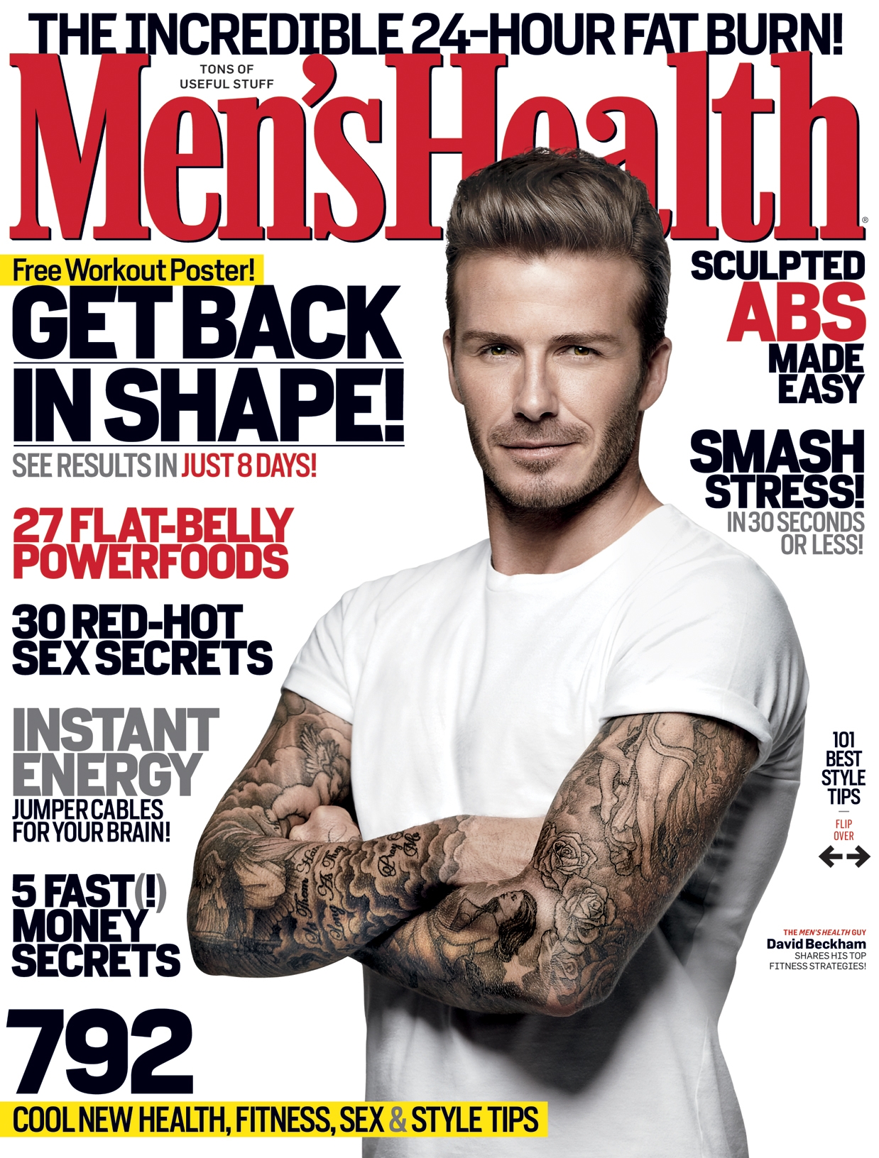
An adult males magazine contains cover lines that talk about get into shape and uses words like 'smash' to show strength and masculinity, so would specifically appeal to a male audience. They cover star is also a well-known footballer which most men are stereotypically into, so would also draw a male audience to the magazine.
However this magazine appeals to women as it's cover lines suggest gossip and the do's and don'ts of fashion, so are stereotypically womanly topics. It uses bright colours like pink and red to grab a womans attention and draw in a female audience.

I have looked at these different magazines to look at the different techniques used to show target audience and can help me to show target audience through my own magazine.

Tuesday, 7 October 2014

Research and planning: Indie Music

Typically, magazines such as NME and Q focus on bands that play indie music. NME and Q are British magazines that write articles on and interview bands such as Arctic Monkeys, The Smiths and many more. Seeing as indie music is what i am mostly in to, NME and Q are appropriate to look at as they mainly focus on what I listen to, and are good 'rolemodels' to base my work off of.

Thursday, 2 October 2014

Drafting and planning: Typography


I think that the most effective font used on these covers is the one used on cover F. I think this because it has clarity and is simple and straight- forward, so therefore gets to the point. This is ideal for a magazine cover as it isn't over the top and is clear, and so sends a sophisticated message to it's readers and viewers.
I think that cover C has the least effective font as it is childish and looks silly and can be patronising to the reader, as it could send a negative message as the reader may think that the magazine is saying they are immature.
I also think that the font used on cover D is not very effective as it is very small and isn't clear. It is also very over the top so makes it too in your face.
I also find cover B quite effective as the bold capitals makes it has clarity and can compliment the main photo as it has a mechanical look to it.
I like the font used on cover E as it is very clear, but I don't like it as I feel that the font is too blocked, so doesn't look as simple and nice.
Cover A also has an ok font as it is clear but it is a boring font that would usually be used to write essays, so doesn't meet the expectations of a magazine and might put people off.
This task is helpful in helping me plan my magazine as it allows me to explore the what the best kind of fonts are to use and what grabs an audience best. It also helps me to see how a font can attract a certain demographic as fonts, such as the one used on cover c, would appeal more to a child than an adult, where as, the font used on cover F would appeal more to an adult audience as it is more mature.