
Tuesday, 28 October 2014
Drafting and Planning: Visual Thesaurus - Magazine Title
By using the visual thesaurus, I have been looking at ideas for a possible name for my magazine. Originally my first ideas where names such as Sonic or Disorder but these were already taken by real life magazines. Whilst going through different words on the visual thesaurus I came across the word 'deep', which I thought would be a good title for my magazine cover as it is short and simple.
This gave me some ideas for titles that are similar to the word 'deep'. However all of the ones that I liked that are similar to 'deep' are already taken so I have settled for 'deep' as my magazine title.

Monday, 27 October 2014
Research Into Similar Products: Double Page Spread Analysis

Research Into Similar Products: Conventions - Cover stars
I am looking at cover stars so I can see what would look good for the cover of a magazine.

This magazine cover shows the two singers of Arcade Fire. They way the present each of the singers is key to this cover. Win Butler has a serious expression showing he sings most of the songs for the band and his tracks are not as carefree as Regine Chassagne's. This therefore sticks to the bands philosophy. Regine's happy facial expression shows how she sings more of the 'poppier' sounding songs so again sticks to the bands philosophy. Direct adress is also used in this cover image to make the reader feel connected to the star and feel the seriousness too of Win's face.
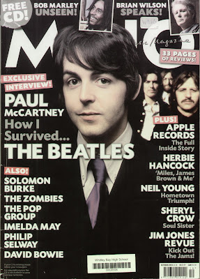
On this cover, The Beatles are shown, but each member is blocked differently. Paul is at the forefront of the image showing that the article involved is to do with Paul, but could also show how some people could consider Paul to be the lead singer of The Beatles. The rest of the band are behind Paul and are smaller than him which suggests that Paul is bigger, popularity wise, than the rest of the band, so the magazine have carefully blocked each member. The fact that John Lennon is at the very back of the image can suggest that he broke up The Beatles and is essentially being punished for it through this image.
I've done this excercise to look at the different effects of the cover image of a magazine. It has shown me the effects of blocking, direct adress and how the facial expression and pose of a cover star can show the philosophy of a band.
This magazine cover shows the two singers of Arcade Fire. They way the present each of the singers is key to this cover. Win Butler has a serious expression showing he sings most of the songs for the band and his tracks are not as carefree as Regine Chassagne's. This therefore sticks to the bands philosophy. Regine's happy facial expression shows how she sings more of the 'poppier' sounding songs so again sticks to the bands philosophy. Direct adress is also used in this cover image to make the reader feel connected to the star and feel the seriousness too of Win's face.
On this cover, The Beatles are shown, but each member is blocked differently. Paul is at the forefront of the image showing that the article involved is to do with Paul, but could also show how some people could consider Paul to be the lead singer of The Beatles. The rest of the band are behind Paul and are smaller than him which suggests that Paul is bigger, popularity wise, than the rest of the band, so the magazine have carefully blocked each member. The fact that John Lennon is at the very back of the image can suggest that he broke up The Beatles and is essentially being punished for it through this image.
I've done this excercise to look at the different effects of the cover image of a magazine. It has shown me the effects of blocking, direct adress and how the facial expression and pose of a cover star can show the philosophy of a band.
Thursday, 23 October 2014
Drafting and Planning: Self assessment of magazine templates
I could use these templates in the future as part of future blog posts to show my progress from this stage and to also gain ideas and look at what I have learnt from the exercise. This will also teach me what looks good on a front cover and lets me practice how to place and use general codes of conventions.
Wednesday, 22 October 2014
Research Into Similar Projects: Genre Crossovers
NME and Q mostly look at 'indie' rock music. However sometimes there are crossovers, in which they feauture stories of pop artists or metal artists.

By including Lady Gaga on the front cover of this magazine, it has widened the target audience for this specific issue, as 'pop' fans would find an interest in this cover. Symbiosis is also used here as it would attract Lady Gaga fans too.

By including Marilyn Manson on this front cover, it attracts metal fans to the magazine also, so widens the target audience and also attracts Manson fans which has the same effect.

However magazines such as Rolling Stone, is one huge genre crossover in itself, as it incorporates all different genres of music into one magazine so appeals to a huge audience rather than one specific audience, so would therefore have more sales and be more successful.

By including Lady Gaga on the front cover of this magazine, it has widened the target audience for this specific issue, as 'pop' fans would find an interest in this cover. Symbiosis is also used here as it would attract Lady Gaga fans too.
By including Marilyn Manson on this front cover, it attracts metal fans to the magazine also, so widens the target audience and also attracts Manson fans which has the same effect.
However magazines such as Rolling Stone, is one huge genre crossover in itself, as it incorporates all different genres of music into one magazine so appeals to a huge audience rather than one specific audience, so would therefore have more sales and be more successful.
Tuesday, 21 October 2014
Organisation: Location
To take photo's for my music magazine, I will take photo's at a park in the snow as the photo would look bright and pure and would add a wintery feel to my magazine, therefore setting a seasonal feel to the issue.
However, if it does not snow before I need to take the photo's, I will use my schools drama room as it has black walls, so would make my models stand out against it. I could also use the walls in my school as they are white so would also have the same effect as the black walls.
By making my artist stand out, it will reflect how they will be the main cover story as will dominate the cover.
However, if it does not snow before I need to take the photo's, I will use my schools drama room as it has black walls, so would make my models stand out against it. I could also use the walls in my school as they are white so would also have the same effect as the black walls.
By making my artist stand out, it will reflect how they will be the main cover story as will dominate the cover.
Monday, 20 October 2014
Drafting & Planning: Magazine Templates

- Here I used black and red for my font colour so that it matched the house style which was set by the masthead.
- I added cover lines that were specific to hip hop music to appeal to a specific target audience.

- On this cover, I used the same house style as the one above to further keep with the theme of the magazine and to carry on appealing to the same target audience.
- I also added a pug which advertises a product in which the reader would hopefully be interested in to further bring in an audience.

- I kept a minimalist theme with this cover to make it simple but effective.
- I used the same colours throughout to compliment the masthead colours and to stick with the house style.
- I kept the colour scheme light so it doesn't overwhelm the main cover photo

- Here I used a bright red colour for the font so that it stands out easily and would therefore stand out on a magazine stand.
- I added the pug of free posters to match up with the usual conventions of a rock magazine, as most offer free posters and incorporated secondary images to help show this.

- I used a quote from a real life Kings of Leon interview as the headline to make the story seem like a more interesting one, so would therefore stand out on a magazine stand and would encourage people to buy the magazine.
- I used simple colours to match what the band are wearing, so it wouldn't look to overbearing.
I did this task to practice using the different codes of conventions in action and to practice using the different typography techniques to make sure I sent a clear message as to what demographic I was trying to attract. Music X and Sound both have similar demographics to what I would like to attract so I can transfer some of the skills I have learnt from this task to make my own final magazine appealing to the same audience.
Subscribe to:
Posts (Atom)